Designing a chart
The Components of a Chart
There are three basic components to most charts:1. the labeling that defines the data: the title, axis titles and labels, legends defining separate data series (graph names), and comments (often to indicate the data source)
2. scales defining the range of the X and Y axes
3. the graphical elements that represent the data: the bars in bar charts, the lines in times series plot, the points in scatterplots, or the slices of a pie chart
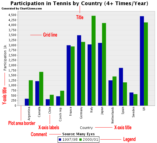
Titles. The title is usually used to define the data series
Axis titles. Axis titles should be brief and should not be used if they are self explanatory
Axis scale. The value or magnitude of the main graphical elements of the chart are defined by either or both the axis scale and individual data labels. Avoid using too many numbers to define the data points
Legends. Legends are usually used in charts with more than one data series and consist of value names
Gridlines. Are displayed by default
Comment. The chart comment is displayed only then the text is entered in the Comment: field of the chart design
Types of Charts
Most charts are a variation on one of four basic types: pie charts, bar charts, time series charts and scatterplots. Choosing the right type of chart depends on the characteristics of the data and the relationships you want displayed.Pie Charts
Pie charts are used to represent the distribution of the components to the whole. The colors of the pie slices are set by default.Bar Charts
Bar charts typically display the relationship between one or more categorical variables with one or more quantitative variables represented by the length of the bars. The categorical variables are usually defined by the categories displayed on the X-axis and, if there is more than one data series, by the legend.Line Charts
Line charts typically display the relationship between one or more categorical variables with one or more quantitative variables represented by marks on the Y axis connected by lines.Scatterplots
The two-dimensional scatterplot is the most efficient medium for the graphical display of data. A scatterplot usually displays the relationship between two interval-level.Create simple chart
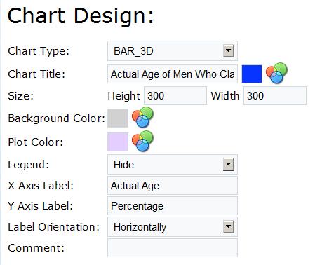
Below is a step-by-step description of creating a simple chart. The chart will display "Actual Age of Men Who Claim to Be 29 Online"Click the New Chart button at the Charts page
Design the chart
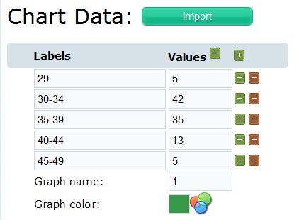
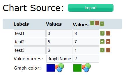
Enter the data in to the table
Click Save & Publish to save the chart and generate the HTML code for your chart
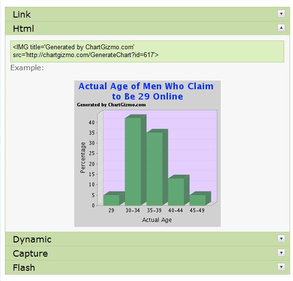
Copy the html code to your page to place the chart there
Result:
Entering/editing the chart data
The chart editor allows you to enter/edit the data manually or copy data from a table editor (e.g. Excel, Access, etc.)Click New Chart or
 to run the chart editor. The chart design and chart source tables are displayed.
Manual data editing
You can add or delete rows and columns using the
 buttons
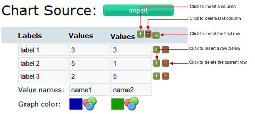
Importing data
Click the Import button to get data from table editor (Excel, Access...) You can select and copy data from an Excel sheet as follows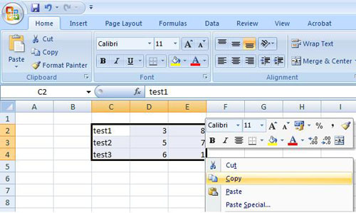
Just insert this data into the text area below. You can also use any tab-delimited data
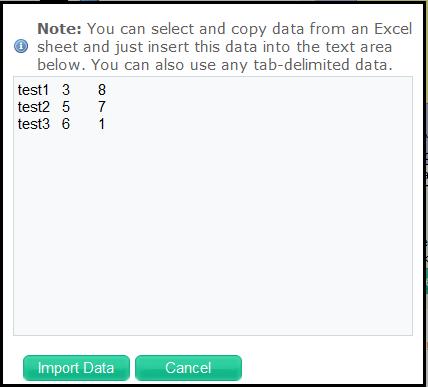
Click Import Data to insert the data to the Chart Source table
Your chart will look as follow
